

Writing Beauty
by Victoria Thomas
Bernard Maisner is a dangerous man who creates dangerous work. Entrance into his world of calligraphic art unfolds like a hundred fairy-tales: what initially seems like a manicured garden turns into a bewitching labyrinth, then an enchanted, eternal forest from which there is no returning.
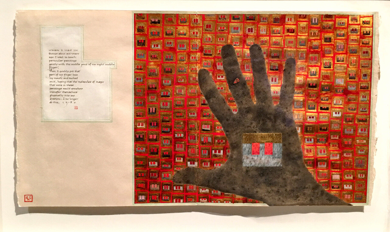
He is a master calligrapher who is also a fine artist, recently reunited with his painting after more than 25 years of focusing on his business, Bernard Maisner Calligraphy & Fine Stationery. One of his paintings from 1980 incorporates a text-box which reads, “When I was in Europe about six years ago, I used to touch particular paintings gently with the middle joint of my right middle finger. Then I quickly put that part of my finger into my mouth and sucked on it, hoping that the molecules of magic that were in these paintings would somehow transfer themselves physically into my system. I no longer do this.”
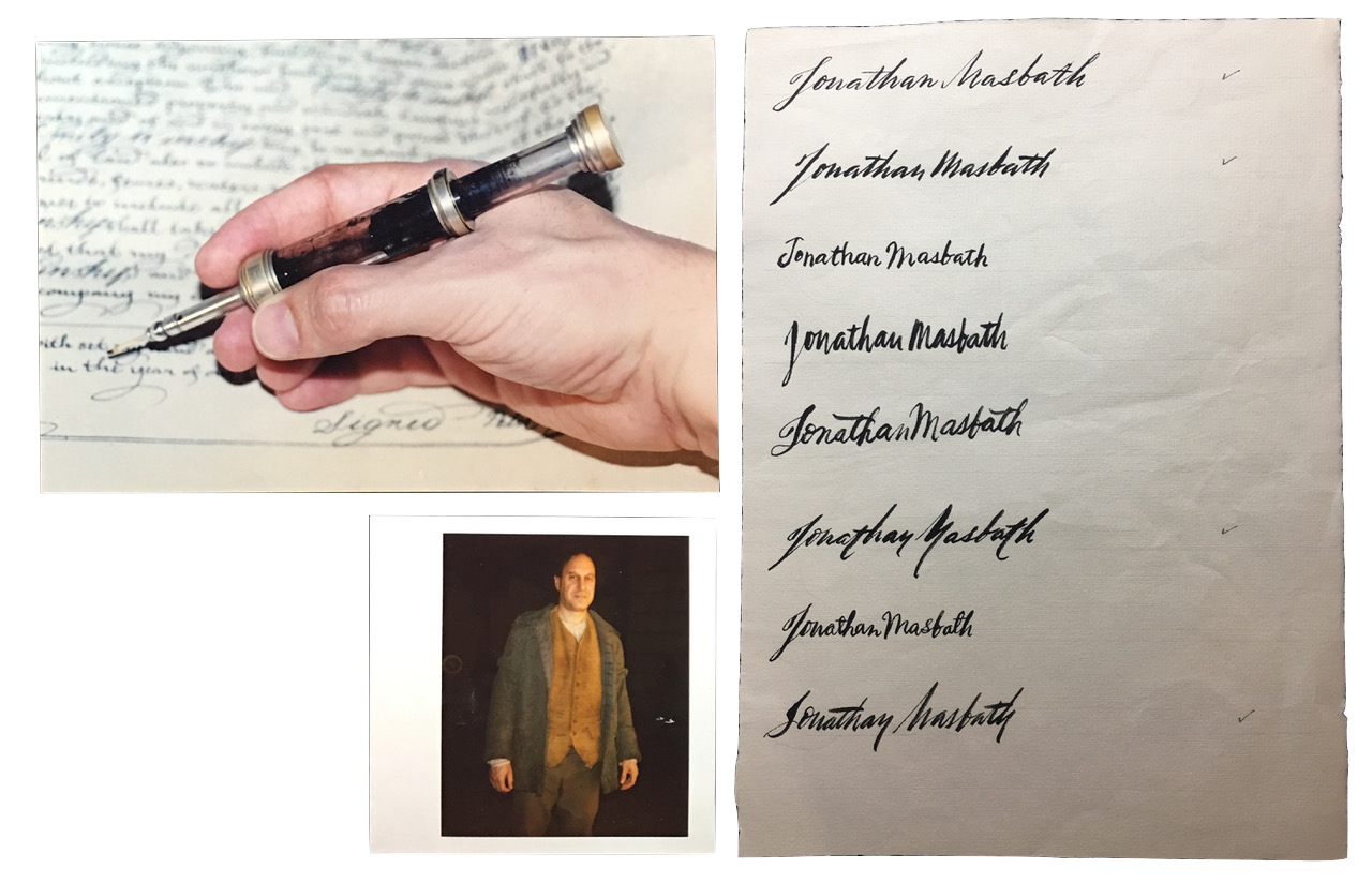
Maisner’s pen and gifted hand have appeared on camera as a stand-in for actors with less than perfect penmanship, including Daniel Day-Lewis, Johnny Depp, and most notably as Leonardo Da Vinci in a Dateline NBC special. His on-screen credits include Martin Scorsese’s “The Age of Innocence” and “Gangs of New York”, Tim Burton’s “Sleepy Hollow”, “P.S. I Love You”, Guy Ritchie’s “Sherlock Holmes”, and “Boardwalk Empire.” He was interviewed as a handwriting expert for the documentary “Rediscovering Alexander Hamilton”, and was featured in a LVMH documentary called “The Art of Craftsmanship Revisited.”
Maisner approaches the work of writing with his entire body, and the resulting painting with words takes the form of visual music. His characters and flourishes rise like a chant, blessed smoke, an offering. And although his calligraphic work is generally secular and commercial, it’s impossible not to feel and hear some tremor of calligraphy’s ritualistic past when we view it.
He recounts, “When I was teaching myself calligraphy, pre-art school, one exercise I would do was to do calligraphy with my eyes closed. I did this for two reasons. Firstly, I would try to see in my mind’s eye the letter I wanted to write. Secondly, to develop the sensitivity and perception of touch of the pen on the paper to an exquisite degree. It is essential to be able to see your writing before actually writing it out. When creating and learning my script calligraphy, at bedtime I would close my eyes and visualize the time-lapsed slow motion writing of a letter, and go through the alphabet. At a certain point I was able to put two letters together in my head, and see variations of those two letters. Eventually I could see entire words with all sorts of joinings and combinations of letters and flourishes in my mind’s eye. Now, when I sit down to do calligraphy, I can automatically pre-visualize what it is I am about to write.”
Christians will instantly associate the medium of calligraphy with the sacred art of medieval monasteries, and indeed many of Maisner’s creations reference the gold-leafed illuminations of sacred vellums. He’s taught workshops on Medieval and Renaissance manuscript illumination techniques, and has lectured at the Getty Museum, The Cloisters Museum, the Metropolitan Museum of Art, and The Pierpont Morgan Library, among others.
Monks often toiled on their manuscripts beneath these words carved into limestone doorways: ora et labora, to pray and work, or seeing work as prayer. Maisner may not identify this calligraphic practice as a form of worship, but he cautions admirers and hobbyists, “My advice for beginning calligraphers would not be popular. I would be strict and harsh, demanding. It is a serious subject, not playtime. The goal is excellence, and to gain an understanding and appreciation of the traditions and history of writing.”
And furthermore: “Lettering to me is deadly serious. It was never fun. Somber, concentrated practice is essential.” He compares the craft to swordsmanship, with the pen nib as his blade.


While the theological art of calligraphy vanished from the Christian world for centuries, Judaism has been a more faithful steward. Jewish law requires that Torah scrolls be written by hand, explained by the rabbinic concept of hiddur mitzvah, or beautifying the commandment. Psalm 29:2 summons the observant to fulfill the charges of Torah in “the beauty of holiness,” and the scribe rejoices in the commandment of creating a Torah scroll following highly prescribed and specific text, layout, letterforms, tools and practices established by centuries of Jewish law and custom. After all, Genesis tells us “In the beginning was the Word, and Word was with G-d, and the Word was G-d.”
For those with an appreciation of Biblical kitsch (see 1:10 in trailer video), the scene in Cecil B. DeMille’s 1956 classic “The Ten Commandments” where YHVH inscribes the Torah onto the stone tablets for an embattled Moses as played by Charlton Heston is perhaps the film’s high point – thus the origin of our phrase, “set in stone.”
Islam has an equally remarkable and sacred calligraphic legacy, and writing and written text are central to Muslim practice. Chapters and excerpts from the Qur’an are a common and almost universal text upon which Islamic calligraphy is based. It’s worth noting that the Prophet Muhammed is quoted as saying “The first thing G-d created was the pen”, the traditional instrument called a qalam, a pen made of dried reed or bamboo.
In the 9th century C.E., paper from China reached Baghdad, and before long libraries in the Muslim world contained hundreds, sometimes thousands of books. Two major written styles, Kufic and Naskh, are expanded by several variations on each, as well as multiple regionally specific styles. Arabic calligraphy was applied to gold coins beginning in 692 CE, and by the 10th century, Persian textile masters were weaving Arabic inscriptions into elaborately patterned silks. The latter were so exquisite that they were seized as trophies by Christian Crusaders, rather than destroyed as spoils of the infidel. Today, Muslim communities are often decorated with calligraffiti, a blend of classical writing and street-tagging techniques that is often dismissed as mere vandalism.

And of course, calligraphy has an ancient and prestigious history in China, where it was a required skill for the ruling class, using ink and brush on paper or silk when the rest of the world was still writing on animal skins.
For many centuries in China, calligraphy was viewed as more valuable than painting or sculpture. How one wrote was judged to be at least as important as what one wrote, and much attention was paid to the execution of the characters and their dynamic ability to express energy. Scholars would analyze how the brush had been used, comparing the perceived speed, pressure and movement to the force of a boulder plummeting down a hillside, or to the gracefulness of fleeting patterns left on the surface of a pond by swimming geese. In Japan as well as China and other parts of Asia, the skill involved in creating great calligraphy was often critiqued and described in terms of breath, as though the writing was being heard instead of seen.
The rigor behind these traditions is familiar territory for Maisner, who began his remarkable career by teaching himself calligraphy while in high school. During a gap year from college, he would rise at 5 AM and practice calligraphy until 7 AM before clocking in at his day-job, then returning home to spend his evenings painting.
He then entered The Cooper Union College of Art in NYC, where his calligraphy teacher placed him among beginners, in spite of his well-developed DIY skills. Maisner recalls, “I was shocked, as I thought I knew it all. It was obviously the best thing for me. He taught me how to see letterforms properly and re-trained all my bad habits from years of naive self-training and poor interpretations about lettering.”
He adds, “When I began my self-taught journey, I used to practice one letter of the alphabet per day, writing only that one letter for a one-hour period. I had read that ancient Islamic calligraphers at the beginning of their training were required to spend an entire year writing out just one letter, and only then could they move on to the rest of the alphabet under the guidance of the master.”
Maisner takes no prisoners, observing that today, “People now do not even know how to properly hold a pen or pencil. You will observe the most contorted positions of hands and fingers when people hold their pens.”
He casts a cold eye over the downgrading of his craft, which unleashes a purist’s screed: “Almost anything now is accepted as calligraphy. In fact, the more untrained you are, the more people seem to like it. Crude and bad lettering appears ‘artisanal’ to the modern eye. Now it is called ‘Modern Calligraphy.’ I call it untrained, crappy and ugly writing. It’s an excuse to not have knowledge of the past, not to have studied and trained, to have ‘fun,’ to have low standards, and to sell more magic markers that make thick and thin lines. The more high tech society becomes, the more crude, hand-made looking things are becoming accepted as an alternative.”
When digital fonts mimicking hand-lettering emerged 25 years ago, Maisner took a different tack and taught himself pointed-pen lettering for envelope addressing and place cards. He spent more than two years developing a script, pointed-pen style of writing that he describes as… “traditional, but updated with a contemporary aesthetic. I essentially blended aspects of Copperplate style of lettering (European, 17th and 18th century) with the Spencerian style of lettering (American, 19th and early 20th century), along with an injection of my own aesthetic. I dropped certain shapes and letterforms that now were difficult or literally unreadable to the modern eye.


I did not see any reason to slavishly repeat the past. I created new letterforms, ligatures and flourishes that reflect our times. Some people have referred to this style as ‘Maisnerian,’ which of course is most flattering.”
Images courtesy of Bernard Maisner.